UI Layout & Hints
Introduction
In implementing the naked objects pattern, Apache Causeway infers as much information from the domain classes as possible. Nevertheless, some metadata relating solely to the UI is inevitably required.
The Apache Causeway programming model includes several mechanisms to influence the way in which the domain objects are rendered in the UI.
-
the layout of application menu items (inferred from domain services)
-
the layout of domain objects (domain entities and view models) allow the positioning of the object members into columns and tabs
-
UI hints provided by the domain object itself returning:
-
the title so the end-user can distinguish one object from another
-
an icon to indicate the type of object (and perhaps its state)
-
CSS styles for additional adhoc styling
-
an alternate layout, for example changed according to the roles of the end-user that is viewing it.
-
-
in collections, how to customise which properties of the associated object appear as columns.
This page discusses these topics.
Names and Descriptions
The name of classes and class members are usually inferred from the Java source code directly.
For example, an action method called placeOrder will be rendered as "Place Order", and a collection called orderItems is rendered as "Order Items".
The same is true for action parameter names also, though note that the code must be compiled with the --parameters flag (to javac).
Occasionally though the desired name is not possible; either the name is a Java reserved word (eg "class"), or might require characters that are not valid, for example abbreviations.
In such cases the name can be specified declaratively. It is also possible to specify a description declaratively; this is used as a tooltip in the UI.
The table below summarizes the annotations available:
| Feature | Named | Description |
|---|---|---|
Class |
||
Property |
||
Collection |
||
Action |
||
Action Parameters |
The framework also supports i18n: locale-specific names and descriptions. For more information, see the beyond-the-basics guide.
Titles, Icons etc.
In Apache Causeway every object is identified to the user by a title (label) and an icon. This is shown in several places: as the main heading for an object; as a link text for an object referencing another object, and also in tables representing collections of objects.
The icon is often the same for all instances of a particular class, but it’s also possible for an individual instance to return a custom icon. This could represent the state of that object (eg a shipped order, say, or overdue library book).
It is also possible for an object to provide a CSS class hint. In conjunction with customized CSS this can be used to apply arbitrary styling; for example each object could be rendered in a page with a different background colour.
Finally, a domain object can even indicate the layout that should be used to render it. For example, a domain object may be rendered differently depending upon the role of the user viewing it.
Object Title
Generally the object title is a label to identify an object to the end-user. There is no requirement for it to be absolutely unique, but it should be "unique enough" to distinguish the object from other object’s likely to be rendered on the same page.
The title is always shown with an icon, so there is generally no need for the title to include information about the object’s type. For example the title of a customer object shouldn’t include the literal string "Customer"; it can just have the customer’s name, reference or some other meaningful business identifier.
Declarative style
The @Title annotation can be used build up the title of an object from its constituent parts.
For example:
import lombok.Getter;

public class Customer {

    @Title(sequence="1", append=" ")    (1)
    @Getter
    private String firstName;

    @Title(sequence="2")                (2)
    @Getter
    private String lastName;

    // ...
}| 1 | First component of the title, with a space afterwards |
| 2 | Second component of the title |
might return "Arthur Clarke", while:
import lombok.Getter;

public class CustomerAlt {

    @Title(sequence="2", prepend=", ")
    @Getter
    private String firstName;

    @Title(sequence="1")
    @Getter
    private String lastName;

    // ...
}
could return "Clarke, Arthur".
Note that the sequence is in Dewey Decimal Format, which allows a subclass to intersperse information within the title. For example:
import lombok.Getter;

public class Author extends Customer {

    @Title(sequence="1.5", append=". ") (1)
    @Getter
    private String middleInitial;

    // ...
}| 1 | "Slots" between the components defined by the superclass |
could return "Arthur C. Clarke".
Imperative style
Alternatively, the title can be provided simply by implementing the title() reserved method.
For example:
public class Author extends Customer {

    public String title() {
        final StringBuilder buf = new StringBuilder();
        buf.append(getFirstName());
        if(getMiddleInitial() != null) {
            buf.append(getMiddleInitial()).append(". ");
        }
        buf.append(getLastName();
        return buf.toString();
    }

    ...
}
A variation on this approach also supports localized names; see beyond-the-basics guide for further details.
Using a UI subscriber
A third alternative is to move the responsibility for deriving the title into a separate subscriber object.
In the target object, we define an appropriate event type and use the @DomainObjectLayout#titleUiEvent() attribute to specify:
@DomainObjectLayout(
    titleUiEvent = Author.TitleUiEvent.class
)
public class Author extends Customer {
    public static class TitleUiEvent
            extends org.apache.causeway.applib.events.ui.TitleUiEvent<Author> {}

    //...
}
The subscriber can then populate this event:
import org.springframework.context.event.EventListener;
import org.springframework.stereotype.Service;
import lombok.val;

@Service
public class AuthorSubscriptions {

    @EventListener(Author.TitleUiEvent.class)
    public void on(Author.TitleUiEvent ev) {
        val author = ev.getSource();
        ev.setTitle(titleOf(author));
    }

    private String titleOf(Author author) {
        val buf = new StringBuilder();
        buf.append(author.getFirstName());
        if(author.getMiddleInitial() != null) {
            buf.append(author.getMiddleInitial()).append(". ");
        }
        buf.append(author.getLastName());
        return buf.toString();
    }
}
UI listeners are useful when using third-party libraries or extensions.
Object Icon
The icon is often the same for all instances of a particular class, and is picked up by convention.
It’s also possible for an individual instance to return a custom icon, typically so that some significant state of that domain object is represented. For example, a custom icon could be used to represent a shipped order, say, or an overdue library loan.
Declarative style
If there is no requirement to customize the icon (the normal case), then the icon is usually picked up as the .png file in the same package as the class.
For example, the icon for a class org.mydomain.myapp.Customer will be org/mydomain/myapp/Customer.png (if it exists).
Alternatively, a font-awesome icon can be used. This is specified using the @DomainObjectLayout#cssClassFa() attribute or in the layout.xml file.
For example:
@DomainObjectLayout( cssClassFa="play" )    (1)
public class InvoiceRun {
    ...
}| 1 | will use the "fa-play" icon. |
Imperative style
To customise the icon on an instance-by-instance basis, we implement the reserved iconName() method.
For example:
public class Order {
    public String iconName() {
        return isShipped() ? "shipped": null;
    }
    // ..
}
In this case, if the Order has shipped then the framework will look for an icon image named "Order-shipped.png" (in the same package as the class).
Otherwise it will just use "Order.png", as normal.
Image Embedding
Since version 4.0.0, when iconName starts with data:,
it is interpreted as a Data URI and rendered as an embedded image.
For example:
import org.apache.causeway.commons.net.DataUri;

class Order {
    public String iconName() {
        BufferedImage icon = ...
        return DataUri.embeddedImage(DataUri.ImageType.PNG, icon)
            .toExternalForm();
    }
    // ...
}
Using a UI subscriber
As for title, the determination of which image file to use for the icon can be externalized into a UI event subscriber.
In the target object, we define an appropriate event type and use the @DomainObjectLayout#iconUiEvent() attribute to specify.
For example:
@DomainObjectLayout(
    iconUiEvent = Order.IconUiEvent.class
)
public class Order {
    public static class IconUiEvent
            extends org.apache.causeway.applib.events.ui.IconUiEvent<Order> {}
    // ..
}
The subscriber can then populate this event:
import org.springframework.context.event.EventListener;
import org.springframework.stereotype.Service;
import lombok.val;

@Service
public class OrderSubscriptions {

    @EventListener(Order.IconUiEvent.class)
    public void on(Order.IconUiEvent ev) {
        val order = ev.getSource();
        ev.setIconName(iconNameOf(order);
    }

    private String iconNameOf(Order order) {
        return order.isShipped() ? "shipped": null;
    }
}
Object CSS Styling
It is also possible for an object to return a CSS class. In conjunction with a viewer-specific customisation of CSS (eg for the Web UI (Wicket viewer), see here) this can be used to apply arbitrary styling; for example each object could be rendered in a page with a different background colour.
Declarative style
To render an object with a particular CSS, use @DomainObjectLayout#cssClass() or in the layout.xml file.
The usage of this CSS class is viewer-specific.
In the case of the Web UI (Wicket viewer), when the domain object is rendered on its own page, this CSS class will appear on a top-level <div>.
Or, when the domain object is rendered as a row in a collection, then the CSS class will appear in a <div> wrapped by the <tr> of the row.
One possible use case would be to render the most important object types with a subtle background colour: Customers shown in light green, or Orders shown in a light pink, for example.
Imperative style
To specify a CSS class on an instance-by-instance basis, we implement the reserved cssClass() method.
For example:
public class Order {
    public String cssClass() {
        return isShipped() ? "shipped": null;       (1)
    }
    ...
}| 1 | the implementation might well be the same as the iconName(). |
If non-null value is returned then the CSS class will be rendered in addition to any declarative CSS class also specified.
Using a UI subscriber
As for title and icon, the determination of which CSS class to render can be externalized into a UI event subscriber.
In the target object, we define an appropriate event type and use the @DomainObjectLayout#cssClassUiEvent() attribute to specify.
For example
@DomainObjectLayout( cssClassUiEvent = Order.CssClassUiEvent.class )
public class Order {
    public static class CssClassUiEvent
            extends org.apache.causeway.applib.events.ui.CssClassUiEvent<Order> {}
    // ..
}
The subscriber can then populate this event:
import org.springframework.context.event.EventListener;
import org.springframework.stereotype.Service;
import lombok.val;

@Service
public class OrderSubscriptions {

    @EventListener(Order.CssClassUiEvent.class)
    public void on(Order.CssClassUiEvent ev) {
        val order = ev.getSource();
        ev.setCssClass(cssClassOf(order));
    }

    private static String cssClassOf(Order order) {
        return order.isShipped() ? "shipped": null;
    }
}
Switching Layouts
A domain object may also have multiple layouts. One reason might be based on the role of the user viewing the object; the object members most relevant to a data entry clerk could be quite different to an manager that is viewing, eg to approve it. The layout could be used to hide some object members, show others.
If an alternative layout is indicated (we’ll look at the mechanics of this below), then this is used to locate an alternative layout file.
For example, if the "edit" layout is specified, then the Xxx.edit.layout.xml file is used (if it exists).
More generally, for a given domain object Xxx, if it has specified a layout yyy, then the framework will search for a file Xxx.yyy.layout.xml on the classpath.
Imperative style
To specify the layout on an instance-by-instance basis, we implement the reserved layout() method.
For example:
public class IncomingInvoice {
    public String layout() {
        return isUserInDataEntryRole() ? "edit": null;
    }
    ...
}
Using a UI subscriber
As for title, icon and CSS, the determination of which layout class to render can be externalized into a UI event subscriber.
In the target object, we define an appropriate event type and use the @DomainObjectLayout#layoutUiEvent() attribute to specify.
For example
@DomainObjectLayout( layoutUiEvent = Order.LayoutUiEvent.class )
public class IncomingInvoice {
    public static class LayoutUiEvent
            extends org.apache.causeway.applib.events.ui.LayoutUiEvent<Order> {}
    // ..
}
The subscriber can then populate this event:
import org.springframework.context.event.EventListener;
import org.springframework.stereotype.Service;
import lombok.val;

@Service
public class IncomingInvoiceSubscriptions {

    @EventListener(IncomingInvoice.LayoutUiEvent.class)
    public void on(IncomingInvoice.LayoutUiEvent ev) {
        val incomingInvoice = ev.getSource();
        ev.setLayout(layoutOf(incomingInvoice));
    }

    private static String layoutOf(IncomingInvoice incomingInvoice) {
        return isUserInDataEntryRole() ? "edit": null;
    }
}
Fallback layouts
In addition to searching for alternate layouts and then the default layout, in the absence of either the framework will also search for a "fallback" layouts.
The use case is to allow libraries that provide domain objects (for example, the SecMan extension) to define the UI of these objects using a layout file, while still allowing the consuming application to override that layout if it so requires.
Thus, for a domain object "Xxx", the framework searches:
-
Xxx.yyy.layout.xml
for layout "yyy" (if a non-null layout "yyy" is specified)
-
Xxx.layout.xml
the default layout
-
Xxx.layout.fallback.xml
the fallback layout
If none of these exist, then the framework will use a layout based on any available annotations. The page will be split 4:8, with the first column for properties and the second column for collections.
Action Icons and CSS
Apache Causeway allows font awesome icons to be associated with each action, and for Bootstrap CSS to be applied to action rendered as buttons. These UI hints can be applied either to individual actions, or can be applied en-masse using pattern matching.
It is also possible to specify additional CSS for an object’s members (not just actions).
Icons
Action icons can be specified in several ways.
One option is to use the @ActionLayout#cssClassFa. For example:
@ActionLayout(cssClassFa="refresh")
public void renew() {
    ...
}
Alternatively, you can specify these hints dynamically in the layout file for the entity:
<cpt:action id="renew" cssClassFa="refresh"/>Rather than annotating every action with @ActionLayout#cssClassFa and @ActionLayout#cssClass you can instead specify the UI hint globally using regular expressions. Not only does this save a lot of boilerplate/editing, it helps ensure consistency across all actions.
To declare fa classes globally, use the causeway.applib.annotation.action-layout.css-class-fa.patterns configuration property (a comma separated list of key:value pairs).
For example:
causeway.applib.annotation.action-layout.css-class-fa.patterns=\
                        new.*:fa-plus,\
                        add.*:fa-plus-square,\
                        create.*:fa-plus,\
                        renew.*:fa-sync,\
                        list.*:fa-list, \
                        all.*:fa-list, \
                        download.*:fa-download, \
                        upload.*:fa-upload, \
                        execute.*:fa-bolt, \
                        run.*:fa-bolt
Here:
-
the key is a regex matching action names (eg
create.*), and -
the value is a font-awesome icon name
For example, "fa-plus" is applied to all action members called "newXxx"
CSS
Similarly, a CSS class can be specified for object members:
-
@ActionLayout#cssClass for actions
-
@PropertyLayout#cssClass for properties, and
-
@CollectionLayout#cssClass for collections.
Again, this CSS class will be attached to an appropriate containing <div> or <span> on the rendered page.
Possible use cases for this is to highlight the most important properties of a domain object.
It is also possible to specify CSS classes globally, using the causeway.applib.annotation.action-layout.css-class.patterns configuration property.
For example:
causeway.applib.annotation.action-layout.css-class.patterns=\
                        delete.*:btn-warning
where (again):
-
the key is a regex matching action names (eg
delete.*), and -
the value is a Bootstrap CSS button class (eg `btn-warning) to be applied
Menu Bars Layout
The actions of domain services (annotated using @DomainService with a nature of VIEW) are made available as menu items on menus.
For example:
@Named("simple.SimpleObjects")
@DomainService                      (1)
public class SimpleObjects {
    // ...
}| 1 | Domain service with actions visible in the UI |
By default each domain service corresponds to a single menu on this menu bar, with its actions as the drop-down menu items.
By annotating the domain service class and its actions, it’s possible to have a little more control over the placement of the menu items; this is discussed below.
For more fine-grained control, though, the menubars.layout.xml file can be supplied, as discussed after.
This file is also read dynamically at runtime, so layouts can be changed during prototyping and the page reloaded to check.
Annotation-based
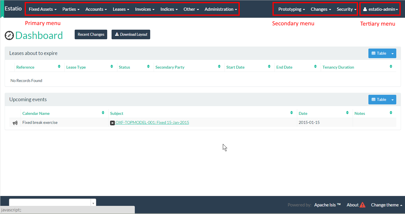
If using annotations, services can be added to either the primary, secondary or tertiary menu bar, as shown in this screenshot shows:
This is done using the @DomainServiceLayout#menuBar() annotation.
For example:
@Named("simple.SimpleObjects")
@DomainService                                                      (1)
@DomainServiceLayout(menuBar = DomainServiceLayout.MenuBar.PRIMARY) (2)
public class SimpleObjects {
    // ...
}| 1 | Domain service with actions visible in the UI |
| 2 | Menu for the service added to the primary menu bar. |
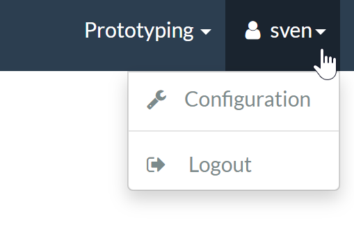
The tertiary menu bar consists of a single unnamed menu, rendered underneath the user’s login, top right. This is intended primarily for actions pertaining to the user themselves, eg their account, profile or settings:
In addition, the @ActionLayout annotation can be used to group and order domain service actions:
-
@ActionLayout#named()is used to define the name of the menuin which the menu items of the domain service action will appear
-
@ActionLayout#sequence()is used to order menu items within that menu.
Thus, using named() it’s possible to group menu items from actions that are from different domain services.
There are some significant limitations, however:
-
domain services are added to the menu bar alphabetically. This cannot be controlled using annotations.
-
there is no way to order or group menu items from multiple domain services that appear on the same menu.
The annotation based approach is therefore useful during very early prototyping, but in real-world applications you should use file based menu layouts.
menubars.layout.xml
Rather than use annotations to specify the location of menu items corresponding to the domain services' actions, the framework instead allow domain service actions to be arranged using the menubars.layout.xml file.
This offers a number of benefits:
-
Probably most significantly, the layout can be updated without requiring a recompile of the code and redeploy of the app; fine-tuning the layout with your end users is easy to do
-
You’ll probably find it easier to reason about menu bars layout when all the hints are collated together in a single place (rather than scattered across the domain service classes as annotations).
There are some disadvantages to using file-based layouts:
-
file-based layouts are not typesafe: a typo will result in the metadata not being picked up for the element.
-
they also suffer from syntactic fragility: an invalid XML document could result in no metadata for the entire class.
The menubars.layout.xml file is just the serialized form of a MenuBars layout class defined within Apache Causeway' applib.
These are JAXB-annotated classes with corresponding XSD schemas; the upshot of that
is that IDEs such as IntelliJ and Eclipse can provide "intellisense", making it easy to author such layout files.
For example, here’s a fragment of that provided by the SimpleApp starter app:
<?xml version="1.0" encoding="UTF-8" standalone="yes"?>
<mb:menuBars
    xsi:schemaLocation="..."
    xmlns:cpt="https://causeway.apache.org/applib/layout/component"
    xmlns:lnk="https://causeway.apache.org/applib/layout/links"
    xmlns:mb="https://causeway.apache.org/applib/layout/menubars/bootstrap3"
    xmlns:xsi="http://www.w3.org/2001/XMLSchema-instance">
    <mb:primary>                                               (1)
        <mb:menu>                                              (2)
            <mb:named>Simple Objects</mb:named>
            <mb:section>                                       (3)
                <mb:serviceAction                              (4)
                        objectType="simple.SimpleObjects"       (5)
                        id="create">
                    <cpt:named>Create</cpt:named>               (6)
                </mb:serviceAction>
                <mb:serviceAction
                        objectType="simple.SimpleObjects"
                        id="findByName">
                    <cpt:named>Find By Name</cpt:named>
                </mb:serviceAction>
                <mb:serviceAction
                        objectType="simple.SimpleObjects"
                        id="listAll">
                    <cpt:named>List All</cpt:named>
                </mb:serviceAction>
            </mb:section>
        </mb:menu>
        <mb:menu unreferencedActions="true">                   (7)
            <mb:named>Other</mb:named>
        </mb:menu>
    </mb:primary>
    <mb:secondary>                                             (8)
        <mb:menu>
            <mb:named>Prototyping</mb:named>
            ...
    </mb:secondary>
    <mb:tertiary>                                              (9)
        <mb:menu>
            ...
        </mb:menu>
    </mb:tertiary>
</mb:menuBars>| 1 | Primary menu bar. | ||
| 2 | Menu on the menu bar | ||
| 3 | References an action of a domain service | ||
| 4 | Divider is placed between each section | ||
| 5 | Identifies the service through its logical type name | ||
| 6 | Optionally override the name inferred from the action | ||
| 7 | Domain service actions not specified elsewhere are displayed on the "Other" menu (with unreferencedActions attribute set to true).
|
||
| 8 | Secondary menu bar. | ||
| 9 | Tertiary menu bar. |
Any domain service actions that are not explicitly listed will be placed under this menu.
The downloaded menubars.layout.xml file can be adjusted as necessary, creating new menus and menu sections.
Once done, it can be saved and the project rebuilt in the IDE.
If running in prototype mode, the file will be dynamically reloaded from the classpath.
Once the application has bootstrapped with a layout file, downloading the "Default" layout (from the prototyping menu) in essence just returns this file.
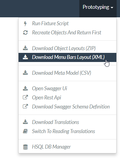
Prototyping menu
The framework provides a large number of menu actions available in prototyping mode.
You can use menubars.layout.xml to arrange these as you see fit, though our recommendation is to place them all in a "Prototyping" secondary menu:
<mb:secondary>
    <mb:menu>
        <mb:named>Prototyping</mb:named>
        <mb:section>
            <mb:named>Fixtures</mb:named>
            <mb:serviceAction objectType="causeway.testing.fixtures.FixtureScripts" id="runFixtureScript"/>
            <mb:serviceAction objectType="causeway.testing.fixtures.FixtureScripts" id="recreateObjectsAndReturnFirst"/>
        </mb:section>
        <mb:section>
            <mb:named>Layouts</mb:named>
            <mb:serviceAction objectType="causeway.applib.LayoutServiceMenu" id="downloadLayouts"/>
            <mb:serviceAction objectType="causeway.applib.LayoutServiceMenu" id="downloadMenuBarsLayout"/>
        </mb:section>
        <mb:section>
            <mb:named>Meta Model and Features</mb:named>
            <mb:serviceAction objectType="causeway.applib.MetaModelServiceMenu" id="downloadMetaModelXml"/>
            <mb:serviceAction objectType="causeway.applib.MetaModelServiceMenu" id="downloadMetaModelCsv"/>
            <mb:serviceAction objectType="causeway.feat.ApplicationFeatureMenu" id="allNamespaces"/>
            <mb:serviceAction objectType="causeway.feat.ApplicationFeatureMenu" id="allTypes"/>
            <mb:serviceAction objectType="causeway.feat.ApplicationFeatureMenu" id="allActions"/>
            <mb:serviceAction objectType="causeway.feat.ApplicationFeatureMenu" id="allProperties"/>
            <mb:serviceAction objectType="causeway.feat.ApplicationFeatureMenu" id="allCollections"/>
        </mb:section>
        <mb:section>
            <mb:named>Persistence</mb:named>
            <mb:serviceAction objectType="causeway.persistence.jdo.JdoMetamodelMenu" id="downloadMetamodels"/>
            <mb:serviceAction objectType="causeway.ext.h2Console.H2ManagerMenu" id="openH2Console"/>
        </mb:section>
        <mb:section>
            <mb:named>REST API</mb:named>
            <mb:serviceAction objectType="causeway.viewer.restfulobjects.SwaggerServiceMenu" id="openSwaggerUi"/>
            <mb:serviceAction objectType="causeway.viewer.restfulobjects.SwaggerServiceMenu" id="openRestApi"/>
            <mb:serviceAction objectType="causeway.viewer.restfulobjects.SwaggerServiceMenu" id="downloadSwaggerSchemaDefinition"/>
        </mb:section>
        <mb:section>
            <mb:named>i18n</mb:named>
            <mb:serviceAction objectType="causeway.applib.TranslationServicePoMenu" id="downloadTranslations"/>
            <mb:serviceAction objectType="causeway.applib.TranslationServicePoMenu" id="resetTranslationCache"/>
            <mb:serviceAction objectType="causeway.applib.TranslationServicePoMenu" id="switchToReadingTranslations"/>
            <mb:serviceAction objectType="causeway.applib.TranslationServicePoMenu" id="switchToWritingTranslations"/>
        </mb:section>
    </mb:menu>
</mb:secondary>
Tertiary menu
The framework also provides a number of menu actions available in production (as oppposed to prototyping) mode.
You can use menubars.layout.xml to arrange these as you see fit, though our recommendation is to place them in the tertiary menu:
<mb:tertiary>
    <mb:menu>
        <mb:named/>
        <mb:section>
            <mb:named>Configuration</mb:named>
            <mb:serviceAction objectType="causeway.conf.ConfigurationMenu" id="configuration"/>
        </mb:section>
        <mb:section>
            <mb:named>Impersonate</mb:named>
            <mb:serviceAction objectType="causeway.sudo.ImpersonateMenu" id="impersonate"/>
            <mb:serviceAction objectType="causeway.sudo.ImpersonateMenu" id="impersonateWithRoles"/>
            <mb:serviceAction objectType="causeway.applib.ImpersonateStopMenu" id="stopImpersonating"/>
        </mb:section>
        <mb:section>
            <mb:serviceAction objectType="causeway.security.LogoutMenu" id="logout"/>
        </mb:section>
    </mb:menu>
</mb:tertiary>
Downloading the layout file
The current menubars.layout.xml can be downloaded from the MenuBarsService (exposed on the prototyping menu):
If there are unknown/unreferenced actions in the "Other" menu (which you would like to place elsewhere), then these will be listed in the downloaded layout, so they can easily be moved elsewhere.
Object Layout
As with menubars, although the layout of objects can be specified using just annotations, in real-world applications you will almost certainly use a companion layout file, Xxx.layout.xml (where Xxx is the entity or view model to be rendered).
File-based layouts offer a number of benefits:
-
Probably most significantly, the layout can be updated without requiring a recompile of the code and redeploy of the app; fine-tuning the layout with your end users is easy to do
-
Many developers also find it easier to rationalize about layout when all the hints are collated together in a single place (rather than scattered across the class members as annotations).
-
UI hints can be provided for mixin contributions that are synthesised at runtime.
It is also possible to download an initial .layout.xml - capturing any existing layout metadata - using the LayoutService (exposed on the prototyping menu) or using a mixin action contributed to every domain object.
There are some downsides, though:
-
file-based layouts are not typesafe: a typo will result in the metadata not being picked up for the element.
-
they suffer from syntactic fragility: an invalid XML document could result in no metadata for the entire class.
-
there is no notion of inheritance, so a
.layout.xmlis required for all concrete classes and also for any abstract classes (if used as a collection type).
The Xxx.layout.xml file is just the serialized form of a Grid layout class defined within Apache Causeway' applib.
These are JAXB-annotated classes with corresponding XSD schemas; the upshot of that is that IDEs such as IntelliJ and Eclipse can provide "intellisense", making iteasy to author such layout files.
Grids vs Components
The layout file distinguishes between two types of element:
-
those that define a grid structure, of: rows, columns, tab groups and tabs.
The rows and columns are closely modelled on Bootstrap (used in the implementation of the Web UI (Wicket viewer)).
-
those that define common components, of: fieldsets (previously called member groups or property groups), properties, collections, actions and also the title/icon of the domain object itself.
More information about these classes can be found in the reference guide. More information on Bootstrap’s grid system can be found here.
By Example
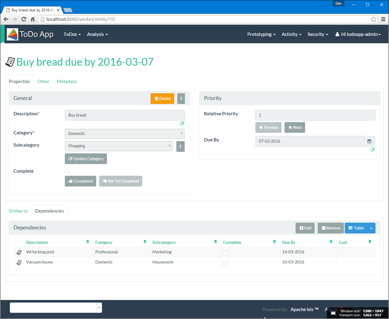
Probably the easiest way to understand dynamic XML layouts is by example, in this case of a "todo item":
Namespaces
Every .layout.xml file must properly declare the XSD namespaces and schemas.
There are two: one for the grid classes, and one for the common component classes:
<?xml version="1.0" encoding="UTF-8" standalone="yes"?>
<!-- Licensed to the Apache Software Foundation (ASF) under one or more contributor
	license agreements. See the NOTICE file distributed with this work for additional
	information regarding copyright ownership. The ASF licenses this file to
	you under the Apache License, Version 2.0 (the "License"); you may not use
	this file except in compliance with the License. You may obtain a copy of
	the License at http://www.apache.org/licenses/LICENSE-2.0 Unless required
	by applicable law or agreed to in writing, software distributed under the
	License is distributed on an "AS IS" BASIS, WITHOUT WARRANTIES OR CONDITIONS
	OF ANY KIND, either express or implied. See the License for the specific
	language governing permissions and limitations under the License. -->
<bs:grid
  xsi:schemaLocation="https://causeway.apache.org/applib/layout/component
                      https://causeway.apache.org/applib/layout/component/component.xsd
                      https://causeway.apache.org/applib/layout/grid/bootstrap3
                      https://causeway.apache.org/applib/layout/grid/bootstrap3/bootstrap3.xsd"
  xmlns:bs="https://causeway.apache.org/applib/layout/grid/bootstrap3"
  xmlns:c="https://causeway.apache.org/applib/layout/component"
  xmlns:xsi="http://www.w3.org/2001/XMLSchema-instance">
    ...
</bs:grid>
Most IDEs will automatically download the XSD schemas from the specified schema locations, thereby providing "intellisense" help as you edit the file.
Rows, full-width cols, and tabs
The example layout consists of three rows: a row for the object/icon, a row containing a properties, and a row containing collections. In all three cases the row contains a single column spanning the full width of the page. For the property and collection rows, the column contains a tab group.
This corresponds to the following XML:
<bs:row>
    <bs:col span="12" unreferencedActions="true">
        <c:domainObject bookmarking="AS_ROOT"/>
    </bs:col>
</bs:row>
<bs:row>
    <bs:col span="12">
        <bs:tabGroup>
            <bs:tab name="Properties">...</bs:tab>
            <bs:tab name="Other">...</bs:tab>
            <bs:tab name="Metadata">...</bs:tab>
        </bs:tabGroup>
    </bs:col>
</bs:row>
<bs:row>
    <bs:col span="12">
        <bs:tabGroup unreferencedCollections="true">
            <bs:tab name="Similar to">...</bs:tab>
            <bs:tab name="Dependencies">...</bs:tab>
        </bs:tabGroup>
    </bs:col>
</bs:row>
You will notice that one of the columns has an unreferencedActions attribute, while one of the tabGroups has a similar unreferencedCollections attribute.
This topic is discussed in more detail below.
Fieldsets
The first tab containing properties is divided into two columns, each of which holds a single fieldset of multiple properties. Those properties in turn can have associated actions.
This corresponds to the following XML:
<bs:tab name="Properties">
    <bs:row>
        <bs:col span="6">
            <c:fieldSet name="General" id="general" unreferencedProperties="true">
                <c:action id="duplicate" position="PANEL_DROPDOWN"/>
                <c:action id="delete"/>
                <c:property id="description"/>
                <c:property id="category"/>
                <c:property id="subcategory">
                    <c:action id="updateCategory"/>
                    <c:action id="analyseCategory" position="RIGHT"/>
                </c:property>
                <c:property id="complete">
                    <c:action id="completed" cssClassFa="fa-thumbs-up"/>
                    <c:action id="notYetCompleted" cssClassFa="fa-thumbs-down"/>
                </c:property>
            </c:fieldSet>
        </bs:col>
        <bs:col span="6">
            ...
        </bs:col>
    </bs:row>
</bs:tab>
The tab defines two columns, each span of 6 (meaning half the width of the page).
In the first column there is a single fieldset.
Notice how actions - such as duplicate and delete - can be associated with this fieldset directly, meaning that they should be rendered on the fieldset’s top panel.
Thereafter the fieldset lists the properties in order. Actions can be associated with properties too; here they are rendered underneath or to the right of the field.
Note also the unreferencedProperties attribute for the fieldset; this topic is discussed in more detail below.
|
The Do be aware though that if there are any actions that have been placed on the fieldset’s panel, then these will not be displayed. |
Collections
In the final row the collections are placed in tabs, simply one collection per tab. This corresponds to the following XML:
<bs:tab name="Similar to">
    <bs:row>
        <bs:col span="12">
            <c:collection defaultView="table" id="similarTo"/>
        </bs:col>
    </bs:row>
</bs:tab>
<bs:tab name="Dependencies">
    <bs:row>
        <bs:col span="12">
            <c:collection defaultView="table" id="dependencies">
                <c:action id="add"/>
                <c:action id="remove"/>
            </c:collection>
        </bs:col>
    </bs:row>
</bs:tab>
As with properties, actions can be associated with collections; this indicates that they should be rendered in the collection’s header.
Unreferenced Members
As noted in the preceding discussion, several of the grid’s regions have either an unreferencedActions, unreferencedCollections or unreferencedProperties attribute.
The rules are:
-
unreferencedActionsattribute can be specified either on a column or on a fieldset.It would normally be typical to use the column holding the
<domainObject/>icon/title, that is as shown in the example. The unreferenced actions then appear as top-level actions for the domain object. -
unreferencedCollectionsattribute can be specified either on a column or on a tabgroup.If specified on a column, then that column will contain each of the unreferenced collections, stacked one on top of the other. If specified on a tab group, then a separate tab will be created for each collection, with that tab containing only that single collection.
-
unreferencedPropertiesattribute can be specified only on a fieldset.
The purpose of these attributes is to indicate where in the layout any unreferenced members should be rendered. Every grid must nominate one region for each of these three member types, the reason being that to ensure that the layout can be used even if it is incomplete with respect to the object members inferred from the Java source code. This might be because the developer forgot to update the layout, or it might be because of a new mixin (property, collection or action) contributed to many objects.
The framework ensures that in any given grid exactly one region is specified for each of the three unreferenced… attributes.
If the grid fails this validation, then a warning message will be displayed, and the invalid XML logged.
The layout XML will then be ignored.
Combining with Annotations
Rather than specify every UI semantic in the layout file, you can optionally combine with a number of annotations. The idea is that the layout.xml is used primarily for the coarse-grained grid layout, with annotations used for the stuff that changes less often, such as associating actions with properties or collections, or the order of properties or actions within a fieldset.
The annotations most relevant here are @PropertyLayout and @ActionLayout:
-
for properties:
-
@PropertyLayout#fieldSetId()and@PropertyLayout#fieldSetName()can be used to associate a property with a fieldset.With this approach all of the fieldsets in the
layout.xmlfile are left empty. The properties "slot into" the relevant field set to associate = "…", sequence = "…")`. -
@PropertyLayout#sequence()specifies the order of properties within their fieldset
-
-
for actions:
-
@Action#associateWith()is used to associate an action with a property. -
@ActionLayout#sequence()specifies the order of actions (if there are multiple actions for a property)
-
There are a number of other "layout" annotations, specifically @PropertyLayout, @CollectionLayout and @ActionLayout.
All of the semantics in these layout annotations can also be specified in the .layout.xml files; which is used is a matter of taste.
In addition, @ParameterLayout provides layout hints for action parameters.
There is no way to specify these semantics in the .layout.xml file (action parameters are not enumerated in the file).
Layout file styles
If you want to make your usage of layout files consistent, then the framework can help because it allows the layout XML files to be downloaded using the LayoutService. This is exposed on the prototyping menu to allow you to download a ZIP file of layout XML files for all domain entities and view models.
When downloading the layout files, there are two "styles" available:
-
COMPLETE... for if you want all layout metadata to be read from the
.layout.xmlfile. Copy the file alongside the domain class.You can then remove all
@ActionLayout,@PropertyLayoutand@CollectionLayoutannotations from the source code of the domain class. -
MINIMAL... for if you want to use layout XML file ONLY to describe the grid.
The grid regions will be empty in this version, and the framework will use the
@PropertyLayout#fieldSetId,@ActionLayout#fieldSetId,@ActionLayout#associateWithand@Action#choicesFromannotation attributes to bind object members to those regions.
In practice, you will probably find yourself somewhere in between these two extremes, deciding which metadata you prefer to define using annotations, and which you like to specify using layout file.
Table Columns
The optional TableColumnOrderService SPI service can be used to reorder columns in a table, either a standalone collection (returned from an action invocation) or for a parented collection (owned by parent domain object).
Standalone Collections
For standalone collections, the file name should be called <Class>.columnOrder.txt, and should reside in the same package as the <Class>.
For example, suppose that an Order entity is returned from various repository queries as a standalone collection.
The visibility of the entity’s properties can be changed using this file:
num
placedOn
state
If this is not present, then the framework will infer an order of the properties from the @PropertyLayout#sequence annotation or by reading from Order.layout.xml.
|
Parented Collections
Suppose there is a Customer and an Order:
When the Order is rendered as a collection of its owning Customer, we may want to fine-tune which of its properties are shown as columns, along with the order of those columns/properties.
This can be controlled using implementation the TableColumnOrderService SPI.
While you are free to implement this as you wish, the framework also provides an out-of-the-box implementation that uses simple text files to specify the column order. These simple files can be reloaded dynamically during prototyping, so make it easy to change the order of columns (or hide columns completely).
In the parented collections this file’s name follows the format "<ParentClass>#<collectionId>.columnOrder.txt".
This should reside in the same package as the <ParentClass>.
In the example above the currentOrders collection would therefore be called Customer#currentOrders.columnOrder.txt, and would look something like:
num
placedOn
state
shippedOn
And similarly, the sequence of the columns shown in the archivedOrders's table would be controlled using Customer#archivedOrders.columnOrder.txt.
num
placedOn
state
shippedOn
If you want to use the same properties in all of these collections, then a wildcard syntax is also supported, following the format "<ParentedClass>#_.<ChildClass>.columnOrder.txt".
For example:
num
placedOn
state
shippedOn
could replace the previous two .columnOrder.txt files.
As a further fallback, if there are no .columnOrder.txt files for the parent class’s collection, then the standalone order will be used if present:
num
placedOn
state
shippedOn
Notes
Commented out and unknown properties
Note also that the following would return the same result:
num
placedOn
#amount
state
shippedOn
nonsense
Here the "amount" is commented out and so is excluded because the line is not an exact match.
The same is true for "nonsense"; it doesn’t match any of the original properties of the Order class.
Customising the Default Implementation
The above behaviour is provided by the TableColumnOrderServiceUsingTxtFile implementation of the TableColumnOrderService SPI.
If necessary, the class can be subclassed to change the convention for searching for class files; just make sure that the subclass has an earlier Precedence than the framework so that it is picked up first.
You could of course also use it as the inspiration of your own more sophisticated implementation.
Fully Custom Implementation
If the out-of-the-box implementation provided by provided by the TableColumnOrderServiceUsingTxtFile is too inflexible, then it can be overridden with a fully custom implementation.
For example:
@Service
@Priority(PriorityPrecedence.EARLY)                     (1)
public class TableColumnOrderServiceForCustomerOrders
                 implements TableColumnOrderService {
    public List<String> orderParented(
            final Object parent,
            final String collectionId,
            final Class<?> collectionType,
            final List<String> propertyIds) {
        return parent instanceof Customer &&            (2)
               "orders".equals(collectionId)
               ? Arrays.asList("num", "placedOn", "state", "shippedOn")
               : null;
    }
    public List<String> orderStandalone(
            final Class<?> collectionType,
            final List<String> propertyIds) {
        return null;                                    (3)
    }
}| 1 | specifies the priority in which the TableColumnOrderService implementations are called. |
| 2 | represents the collection that this service can advise upon |
| 3 | provides no advice |
(Of course, this particular implementation does nothing that is not also provided by the default implementation).